


My older daughter just received her results from the WASL (Washington Assessment of Student Learning), which is this state's test that is actually used to assess schools. I have ethical issues with requiring students to take tests that don't benefit them. In the case of the WASL, all that students receive is their scores; they get no feedback that they could use to identify weaknesses, nor does the score impact their education beyond the requirement that they spend time studying for the test.
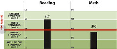
But that's not the topic of this post. Instead, I'd like you to look at the sample bar chart, taken from this annotated example. It's not too dissimilar from what we received for our daughter, except for details such as her scores and comparisons with her school, school district, and state averages.
Look at the vertical scale for this bar chart. The first thing we notice is that the Y axis doesn't start at zero, yet there is no indication in the bars that their bottoms are cut off. Maybe we could dismiss this; perhaps the purpose of this graph is to show differences (more obvious in what we got, which has multiple bars). But look at the numbers on the Y axis: each of the four categories takes up the same space on the axis, even though their ranges vary widely, from a minimum of 25 to a maximum of 275!
In other words, the vertical scale provides no useful information, and in fact is misleading in implying that all four categories have similar ranges. Not only that, but by sharing ranges between reading and math, the fact that the ranges for the same categories differ is obscured.
So, the heights of the bars are meaningless. Bars with tops in different categories cannot be compared because of the nonlinear scaling. Bars in different tests cannot be compared. About the only information conveyed by this graph is the category that the student in question's score fell within, and possibly the relative position within that category. This begs the question: if the folks who design the WASL report can produce such a bad graph, how confident can one be in the rest of the testing and scoring process?
Topics: education, testing.
Sunday, September 24, 2006
Subscribe to:
Post Comments (Atom)

No comments:
Post a Comment
Note: Only a member of this blog may post a comment.